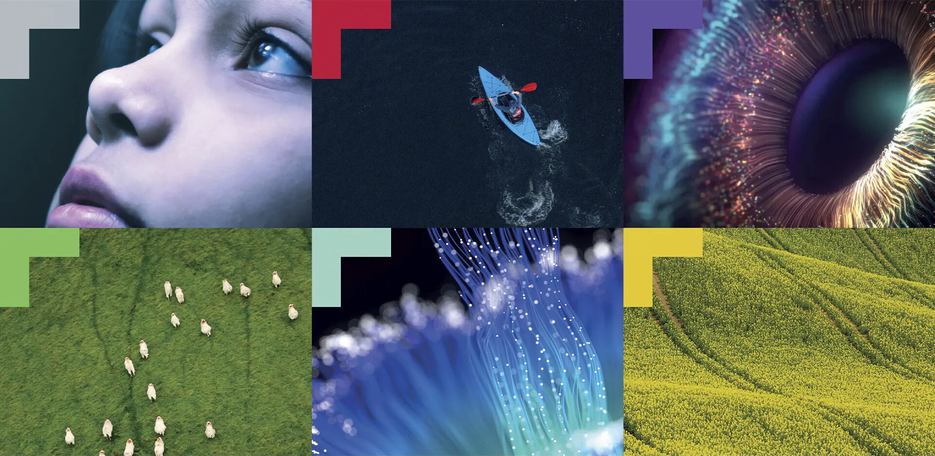
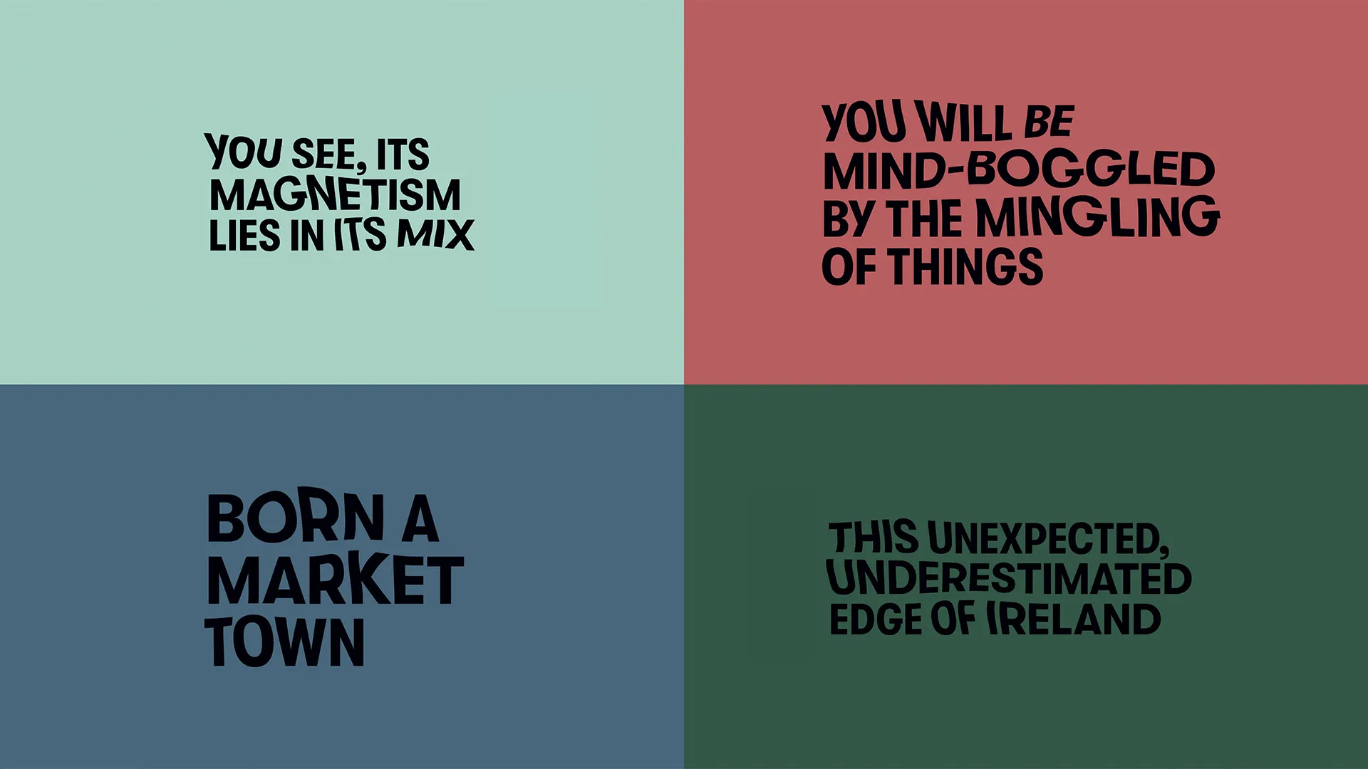
We started with the name, flipping the “L” 90 degrees to create a northwest arrowhead—the town’s location in Ireland. That inspired our approach to the rest of the brand communication—text, photography, and videography all gravitated northwest. The new brand line—”Northwest of all”—underscored this approach. We ensured that Letterkenny’s Irish name—Leitir Ceanainn—worked in the refreshed typography and coined “LKY” to symbolise the ambition of the regeneration project.
We selected a spectrum of colours, taking inspiration from Letterkenny’s architecture and spaces to reflect everyone in the community. Finally, we showcased this fluid, bold, and ambitious brand system in a video for stakeholders and the wider community.


