Putting functionality before fashion
It wasn’t always the case that football kit design and creativity went hand-in-hand. In the mid-2000s the approach was very much template based, where the structure was the same and the colour (and badge) were changed to suit. This was common across both international and club football, as it was more efficient for manufacturers, easier to produce, and helped maintain brand consistency.
At the time, fans weren’t necessarily calling out for more thought-provoking or distinctive designs either. A well-known example of this is Nike’s ‘Total 90’ template, which seemed to be everywhere, but every major brand followed a similar approach.
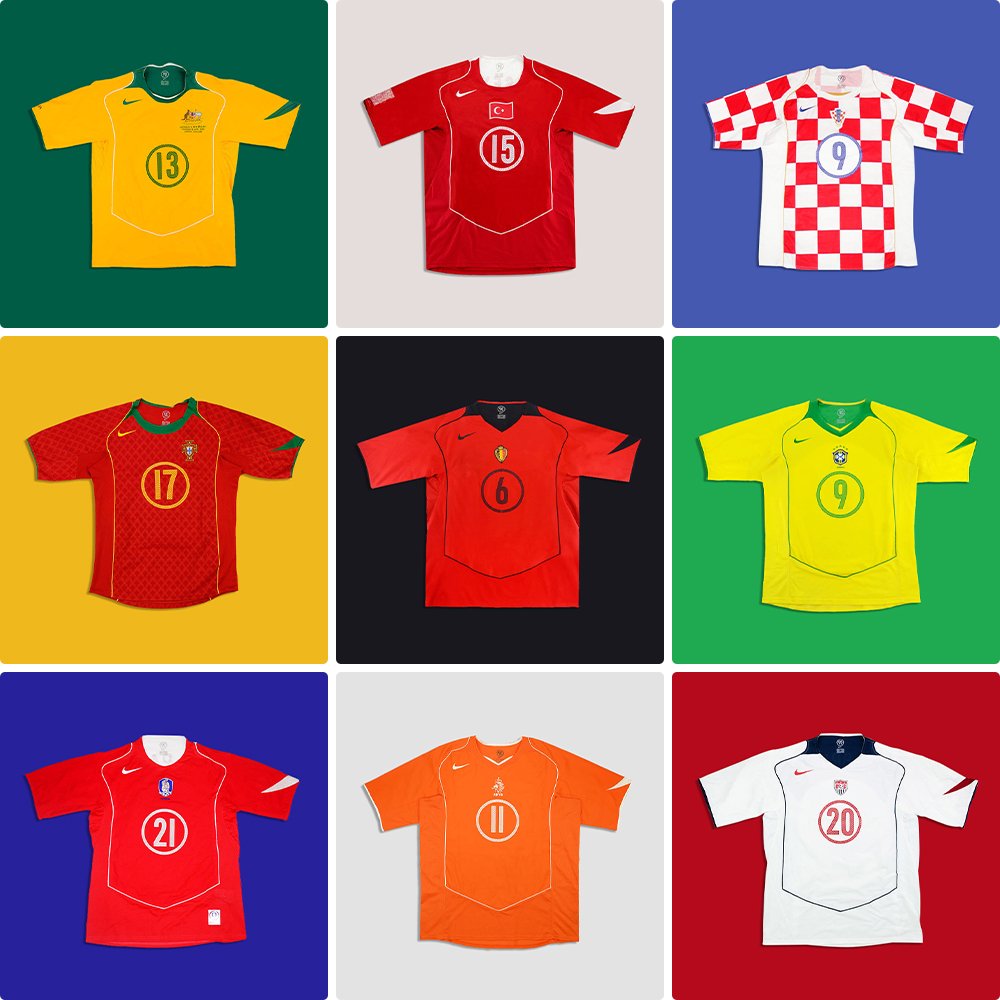
This approach didn’t affect sales; fans still bought the tops and even now these template-based pieces make an impact in the vintage market.
In the 2000s, football shirt sales were driven by affiliation to clubs and by the stars at each team. A prime example of this is when David Beckham made the move from Manchester United to Real Madrid and sold over one million shirts in the first year of his four-year stay at the club.
The design and innovation behind the kits were secondary factors, because they could be.
So, why have kit manufacturers made the move away from this approach?
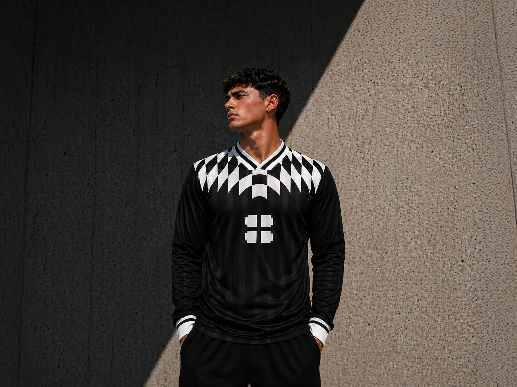
The emergence of blokecore in the fashion industry
The answer lies in how the football shirt has changed. It is no longer just sportswear or fan-wear, it now sits at the intersection of fashion, identity and culture. Design creativity in this space has evolved and kit manufacturers are trying to take advantage of this.
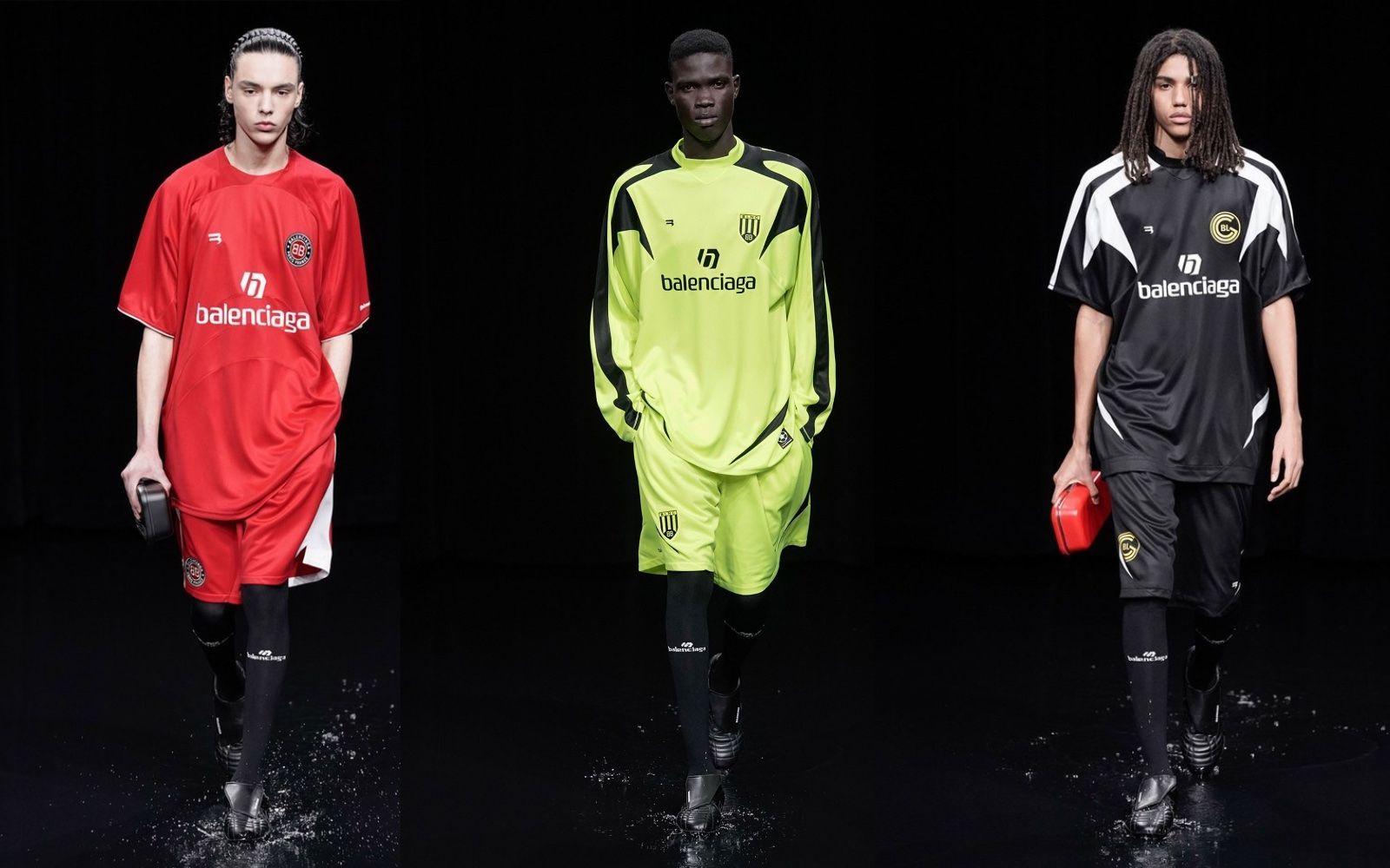
Football kit aesthetics (dubbed as “blokecore”) have been creeping into luxury and high-end fashion. The likes of Balenciaga, Gucci, Louis Vuitton, Off-White and Wales Bonner have all either collaborated with teams, or released their own spin on football kits, using bold graphics and sponsor-style branding.
This has shifted football kits from being sports or fan-wear to being cultural fashion pieces.
The impact of vintage
Another aspect of this has been the rise of retro or vintage football kits. According to El Pais, searches for vintage football shirts have increased by 5,000% in a year, with resale platform searches up 400% (August 2025). It is estimated that the resale boom is valued at approximately £5 billion.
It’s difficult to pin this on one thing, but nostalgia plays a significant role, alongside blokecore trends and the crossover with luxury and streetwear brands.
The shift has made authentic, vintage football tops sought after pieces, selling for much more than they would have when they were originally released. This type of impact can’t be ignored, and brands want to make sure they are capitalising on it.
Value added by design
We can establish that football kits have evolved beyond their original purpose and now have a place within fashion and culture. The style isn’t being borrowed anymore, it’s been adopted, pushing beyond a trend.
This shift shows a tangible example of how value is being placed back into design. The template approach was working, it was delivering sales, but it wasn’t having the same impact on culture and the world beyond football.
That’s what well thought out and considered design can do. It can tell a story, represent something more than what’s visible – and ultimately, look good.
Taking time to craft something meaningful, that isn’t one-size-fits-all, has become a key driver of value. Even looking at the vintage market, these shirts are so sought after because they stand out, they feel like a piece of history and back then clubs and countries would try and differentiate from each other. This approach has come full circle, but this time the circle has taken a detour through high-end fashion houses and designer studios.
Kits to look out for
For the first time ever, there will be 48 teams competing at this year’s World Cup. That’s a lot of kits and designs, so we are not going to go through them all, but have picked our top 5, completely subjectively, but based opinions on looks and the story behind the design.
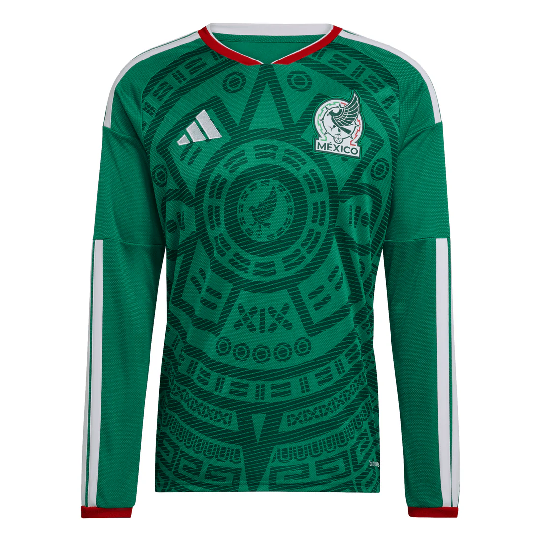
Mexico home (Adidas)
Looks
The green makes it very striking, and the badge is less minimalist than it has been recently, which feels like a good decision as one of the host countries.
Story
The shirt pays homage to the 1998 World Cup shirt; the Aztec inspired design has been brought back and modernised.
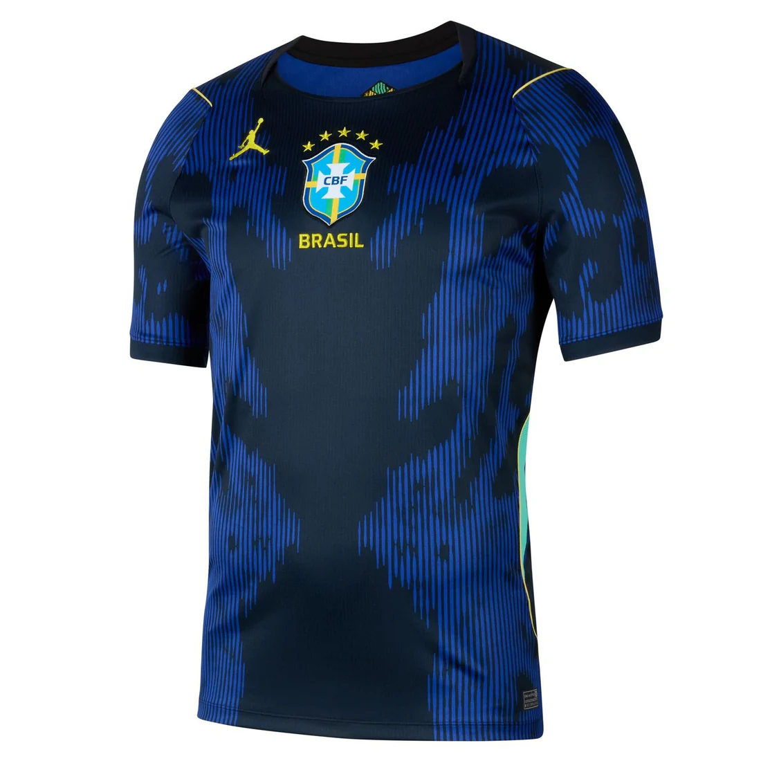
Brazil away (Nike)
Looks
Designed in collaboration with the Jordan brand this shirt it’s a departure from the traditional royal blue Brazil would normally opt for in their away kits. Instead, they’ve taken a more experimental approach with colour and design.
Story
The graphics and colours used on the shirt are inspired by poisonous dart frogs found in the Amazon rainforest, tying the design back to Brazil’s natural environment.
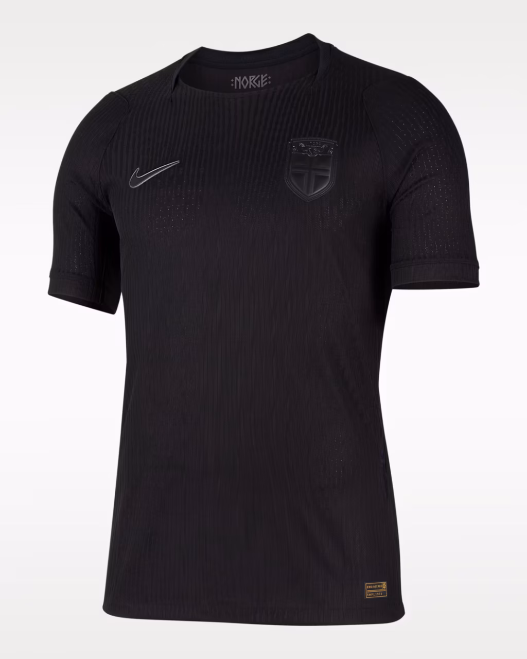
Norway away (Nike)
Looks
All black, stealth inspired kit. Really simple, and offers a stark contrast to their brightly coloured home shirt which borrows the red, white and blue colours from the Norway flag.
Story
Reports suggest the Norway kits are based on the concept of “Fa De Gjort” (Get It Done), and are meant to blend cultural heritage with a sense of quiet confidence. This quiet confidence is communicated by the no-thrills, all black kit.
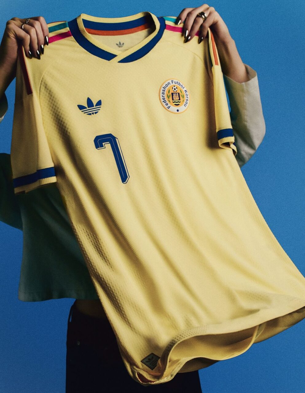
Curaçao away (Adidas)
Looks
The bright yellow and pastel colours really stand out. As the smallest nation to ever qualify for the World Cup, they are going the right way about making an impression.
Story
The colours of the kit are inspired by the vibrant architecture of the capital city Willemstad, with pastel tones reflecting the colourful buildings.
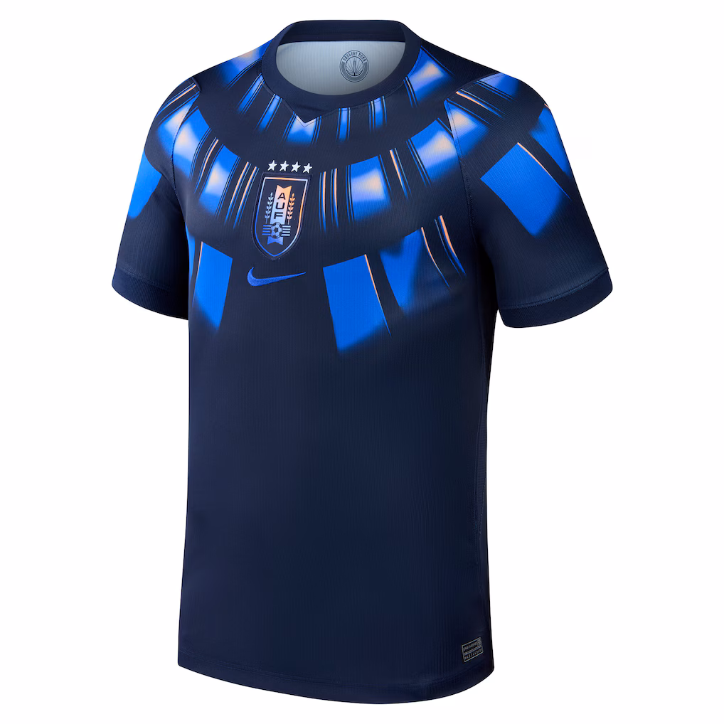
Uruguay away (Nike)
Looks
A really striking shirt that utilises more traditional elements and blends them with modern design. The idea behind the pattern is to resemble ancient indigenous armour.
Story
The kit celebrates Uruguay as the birthplace of the World Cup and the tournament’s first winners, with references to the original trophy woven into the design. An Art Deco-inspired typeface, drawn from the commemorative plaque at Estadio Centenario (the stadium that hosted the first World Cup final) links past and present, bringing heritage into a more modern, disruptive design.
Get in touch
If you would also like to see how strategic, well thought out design could add value to your business, get in touch at info@bigandbold.com.
We would love to talk to you about your project.

By David Kernaghan
1st May 2026 • Updated on 1st May 2026
World Cup 2026: Showcasing the value of design
With the World Cup fast approaching, we are looking forward to seeing the best in the world compete for the top international prize in the most played sport across the globe. The 2022 World Cup final attracted close to 1.5 billion viewers. With that level of global attention, it presents a huge opportunity for sports brands to showcase their creativity.